More (FreshMenu)
A campaign system for FreshMenu built around the idea of more — bigger menus, richer taste, fuller bowls.
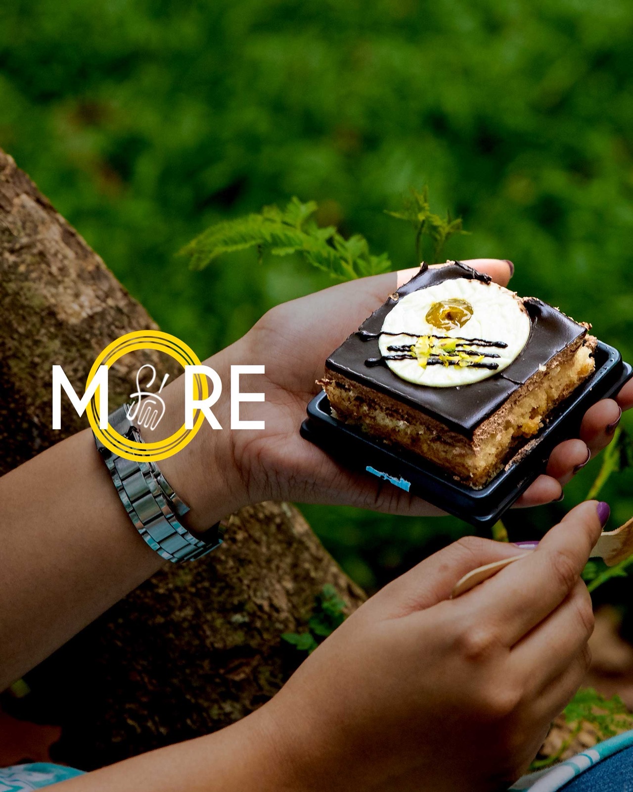
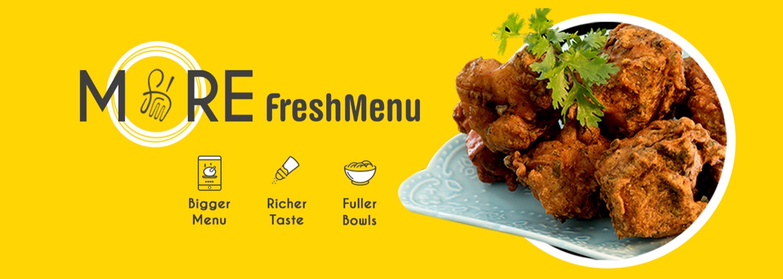
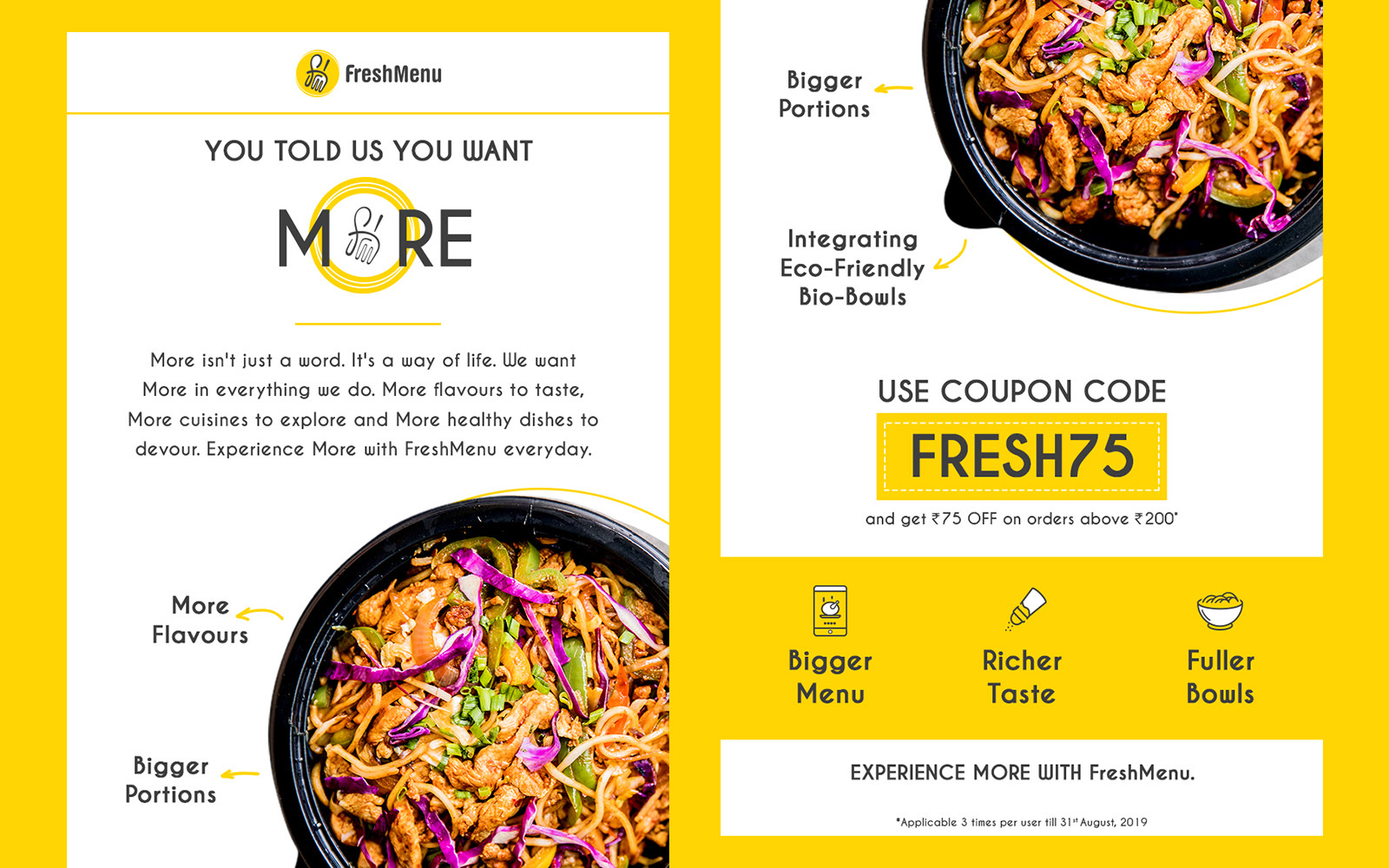
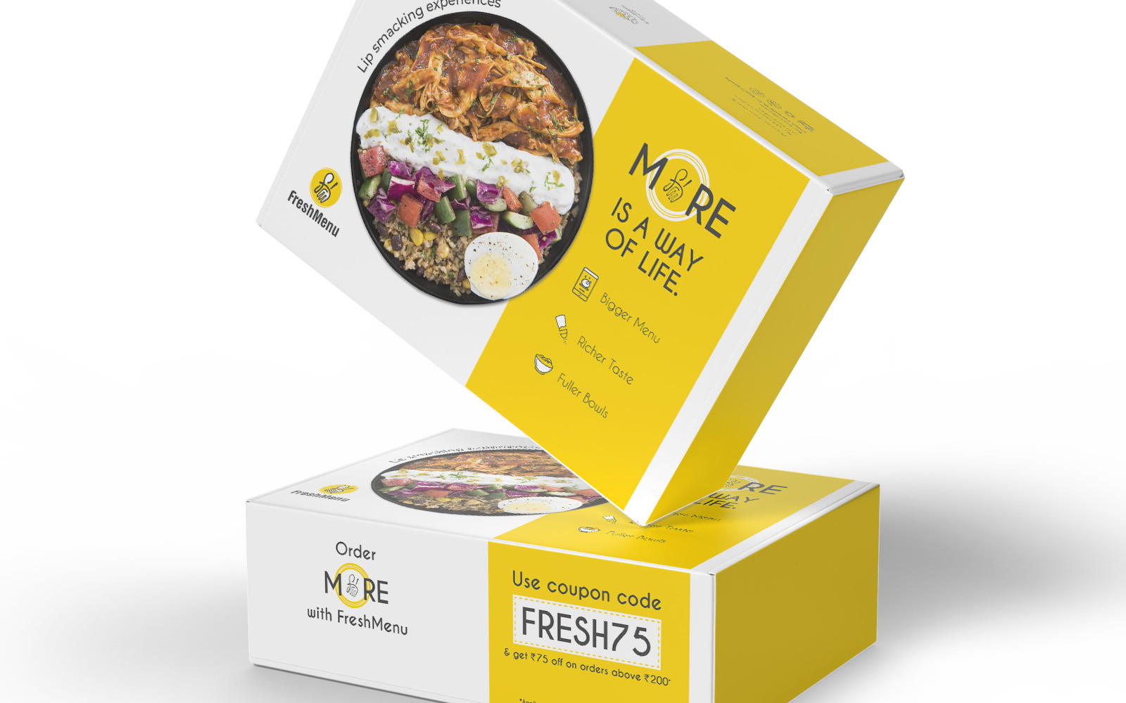
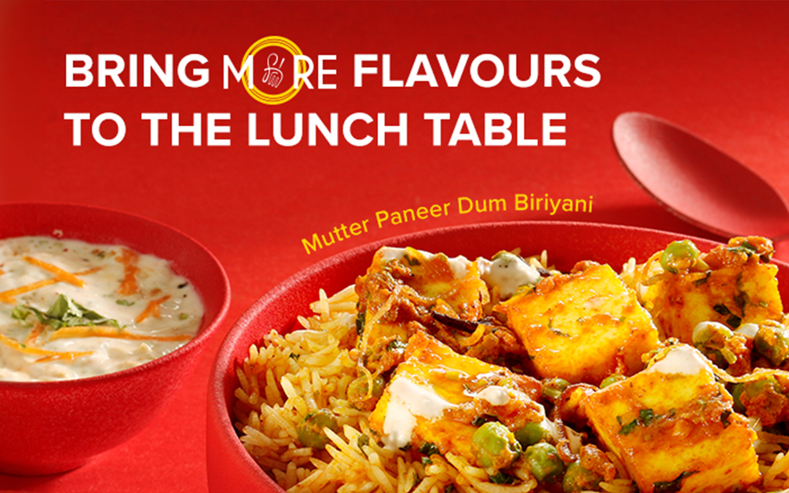
FreshMenu's More campaign celebrates a single, generous idea: more food, more flavour, more memorable meals. The visual centerpiece is the word MORE itself, where the integrated O mirrors the FreshMenu logo so the campaign and brand stay visually linked at every touchpoint.
I designed a complete kit — stroke and fill icons, digital banners, print material, and promo items — that carries the More idea across formats. Each surface uses the typographic centerpiece, the FreshMenu-linked O, and a warm orange palette so the campaign feels unified from menu card to social tile.
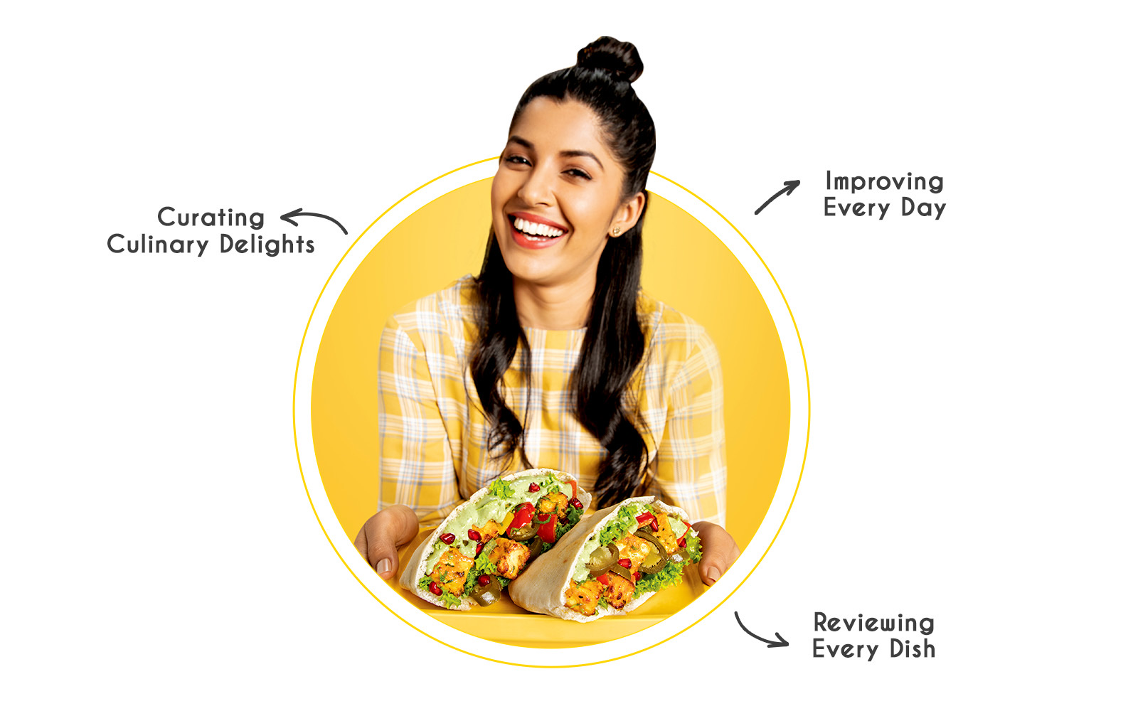
More than just food — culinary journeys that leave a lasting impression.
More (FreshMenu)