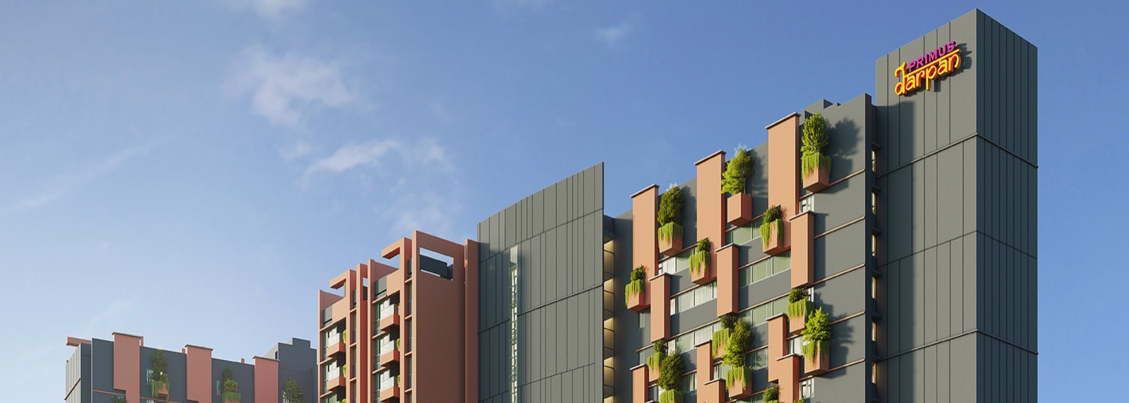
Senior Living Real Estate
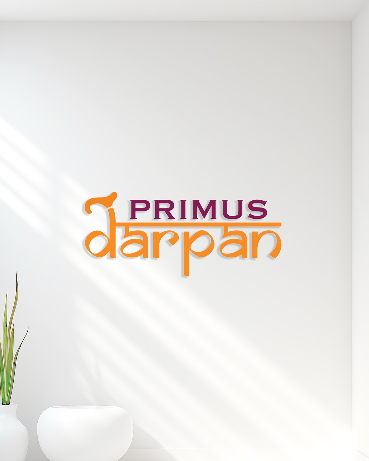
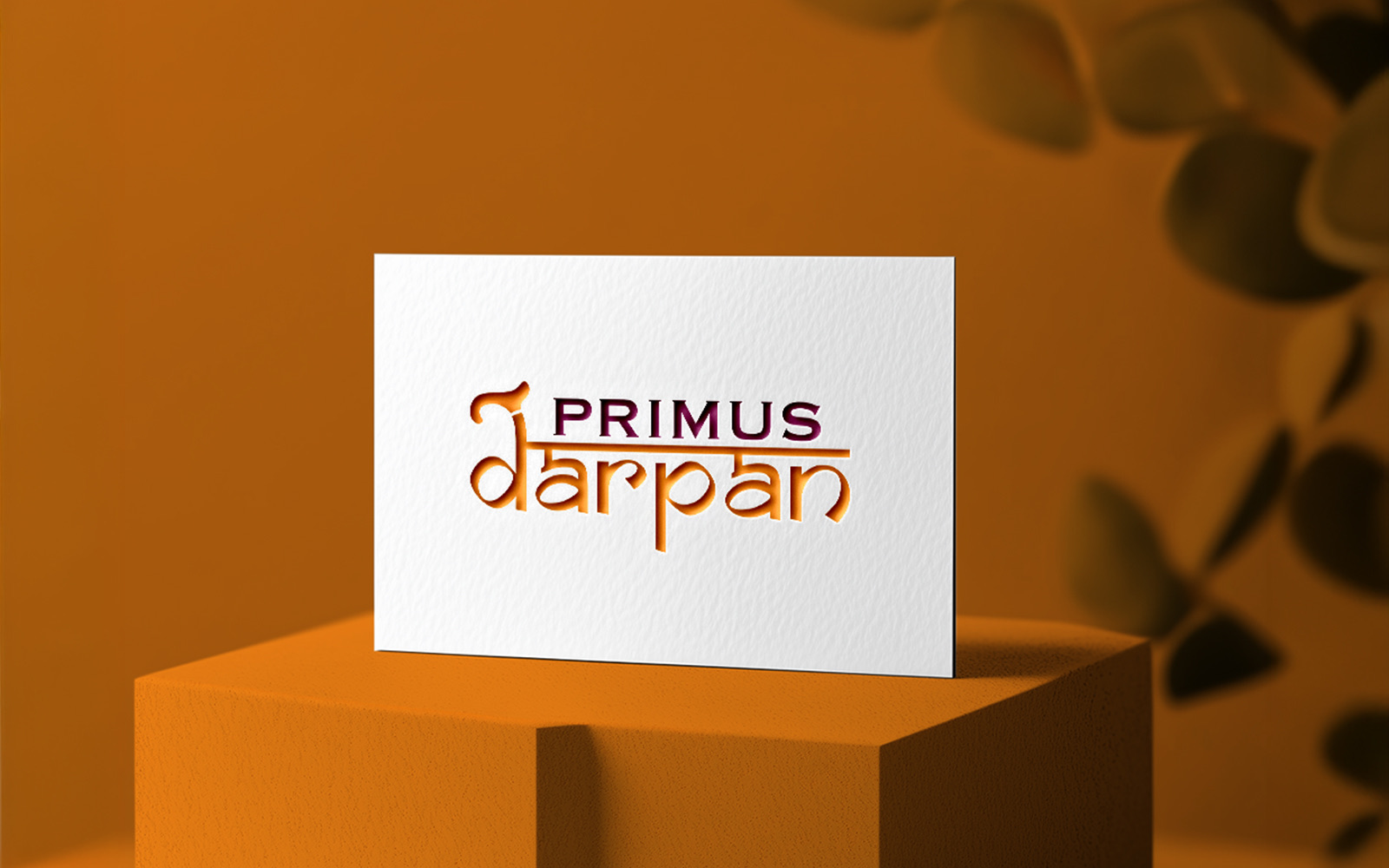
Primus Darpan
A senior-living sub-brand grounded in support, dignity, and care.
Concept
Darpan integrates a walking stick into the letter D — a quiet visual cue for support, dignity, and care. Saffron carries the cultural reading: auspiciousness, vitality, and positive energy.
Instead of the usual aging imagery, the visual strategy leans into vitality. Black-and-white photography paired with playful vector overlays, bold typography, and contemporary layouts say what the brand wants to say — that growing older can be filled with laughter, creativity, and a renewed sense of purpose.
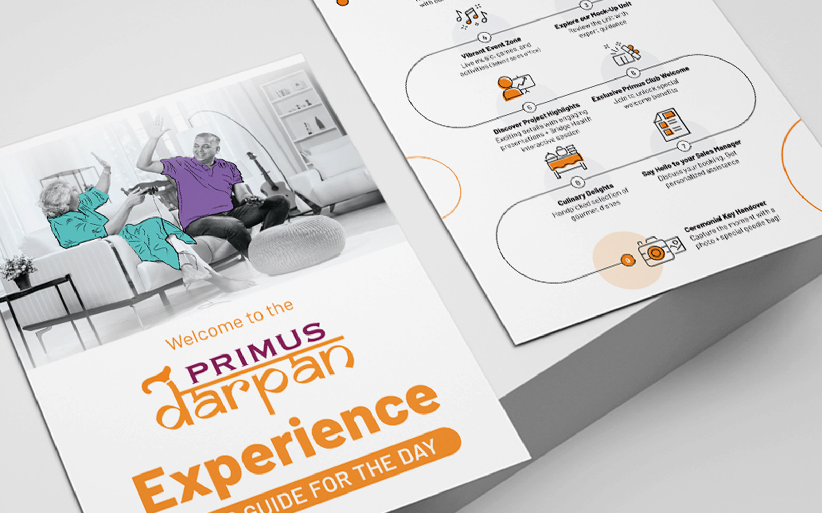
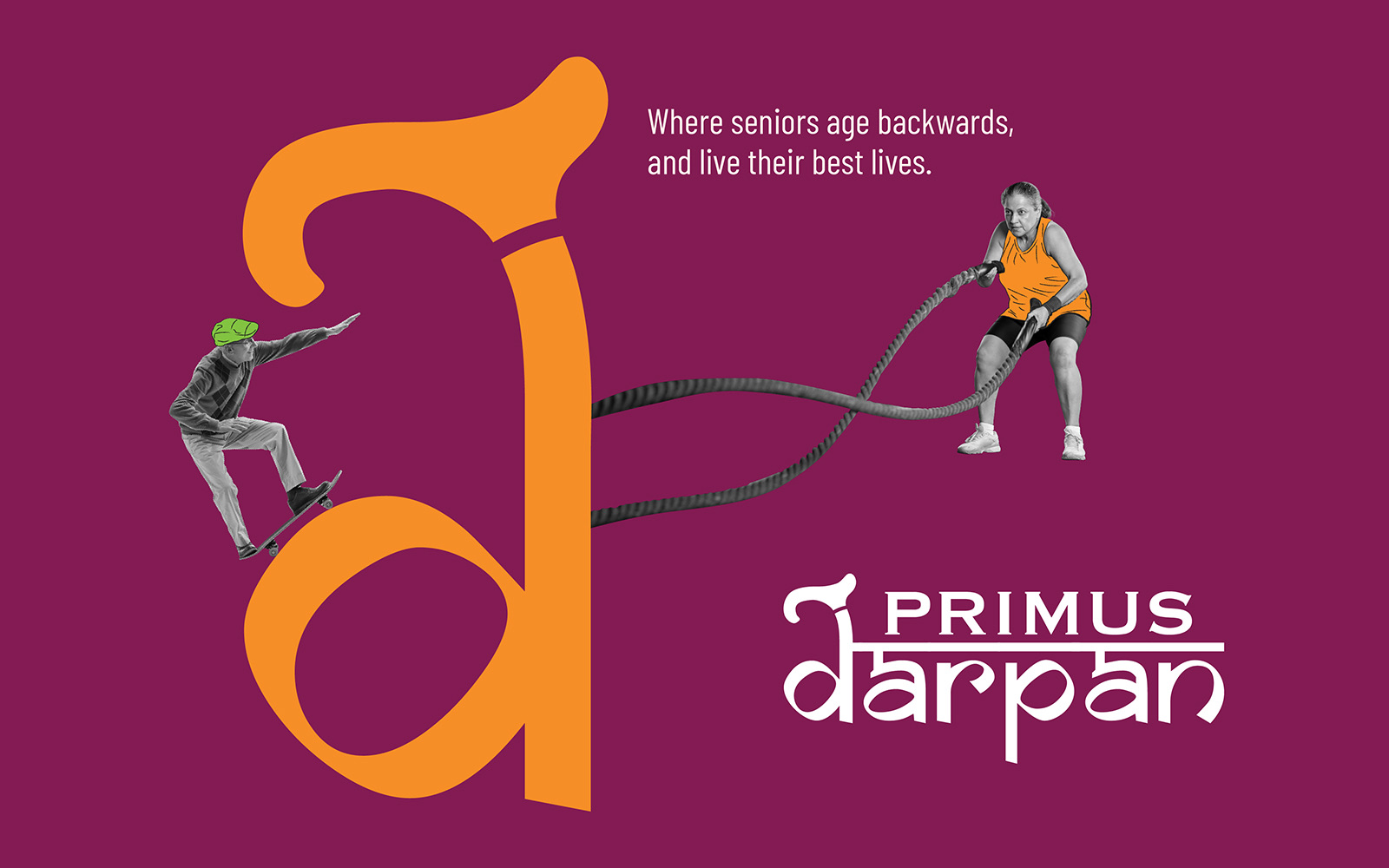
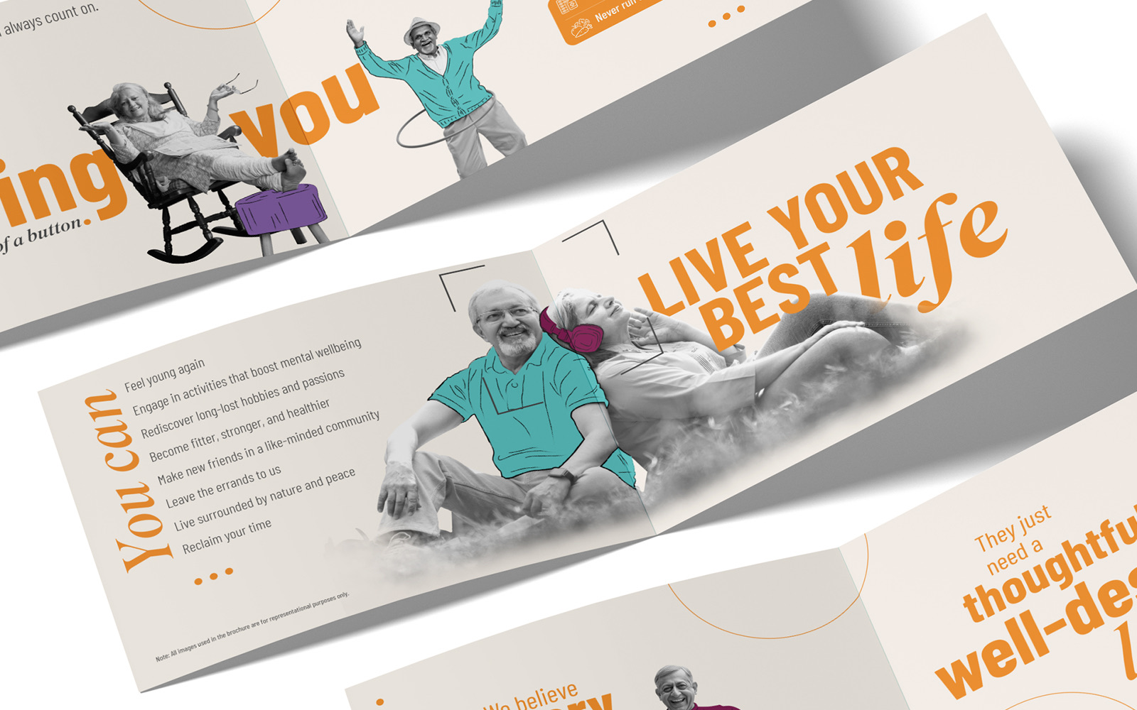
Growing older — filled with laughter, creativity, and a renewed sense of purpose.
Primus Darpan