Brewstone
A hospitality identity built around a sharp blue world that travels from cup to feed.
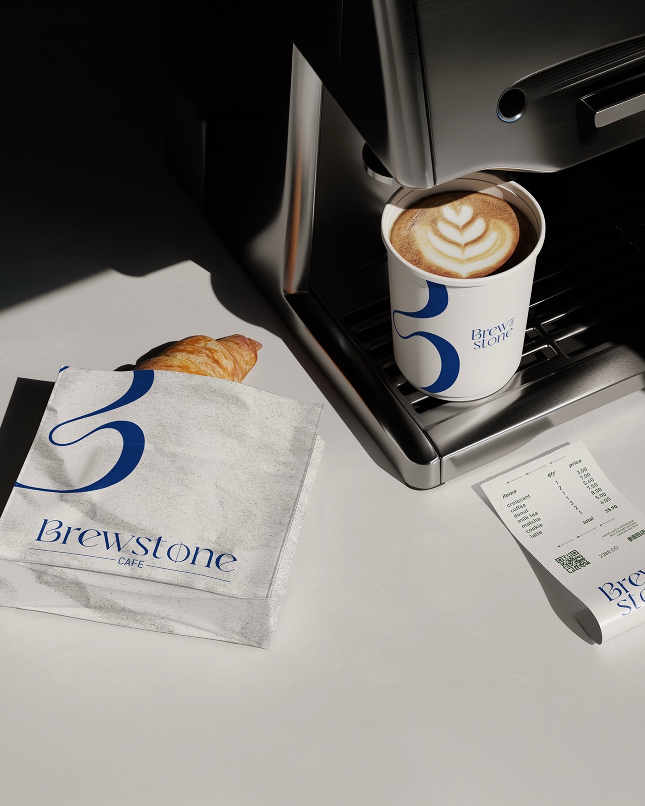
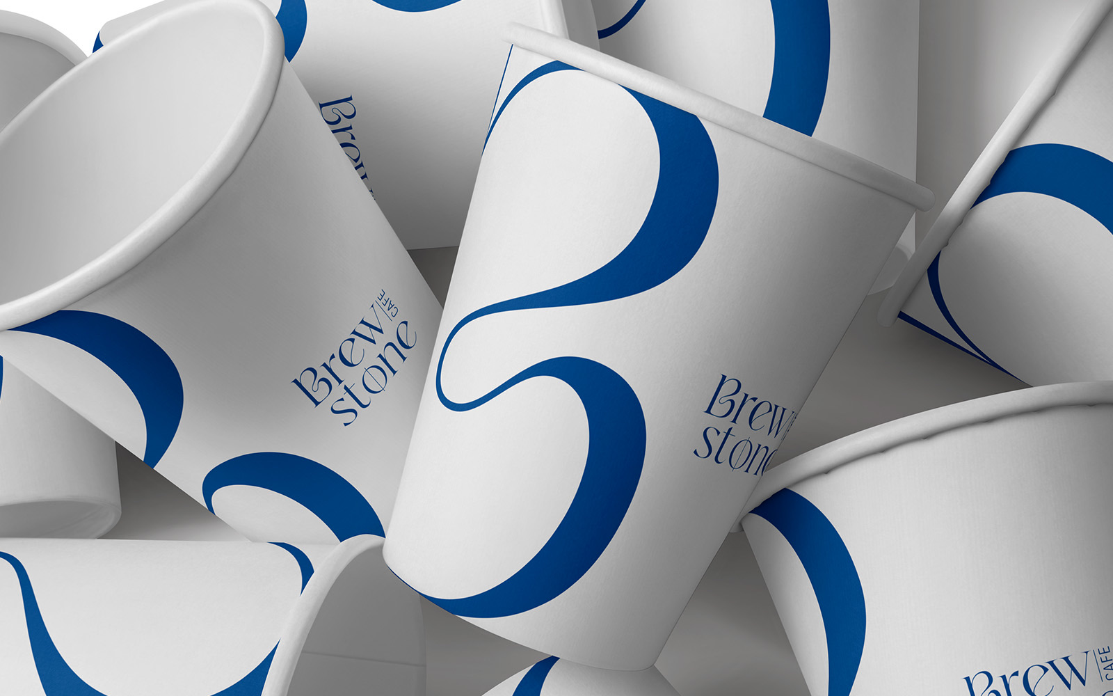
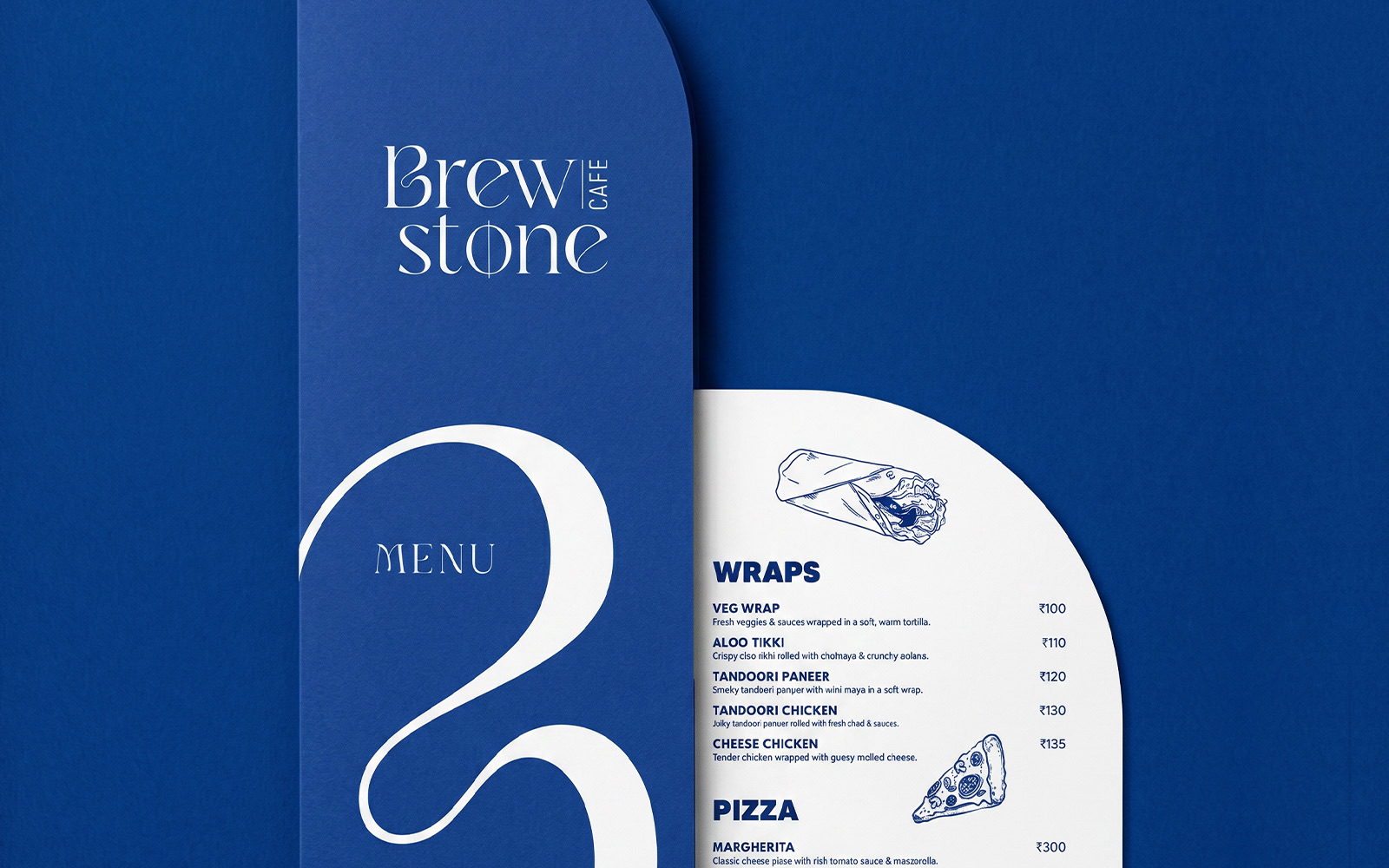
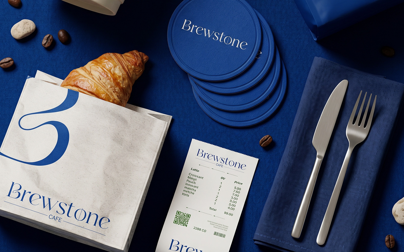
Brewstone needed a mark that could sit on a saucer and on a smartphone with the same confidence. The wordmark stays compact and quiet; the world around it does the heavy lifting — a deep cobalt environment, a single photographic point of view, and a small set of social marks that snap together as a recognisable signature.
The system is built in three parts: a wordmark with two weights, a photographic vocabulary that keeps the blue front and centre, and a kit of social applications — display pictures, posts, and stories — that move the same idea across the feed without softening it.
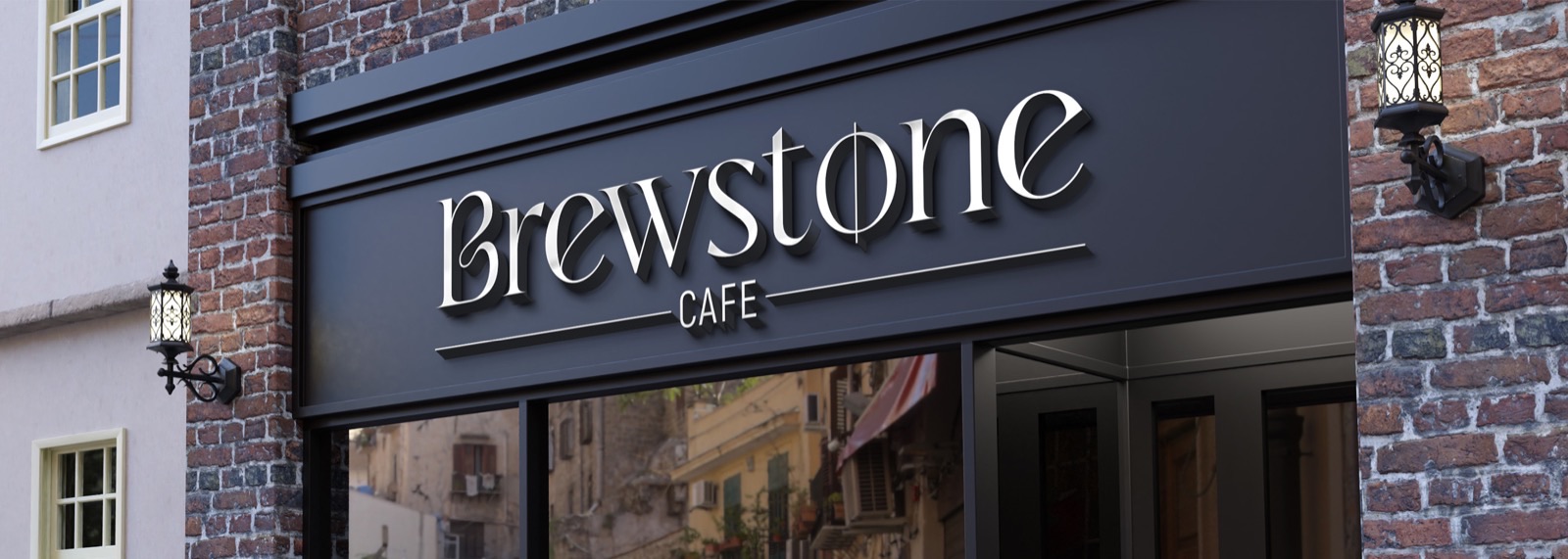
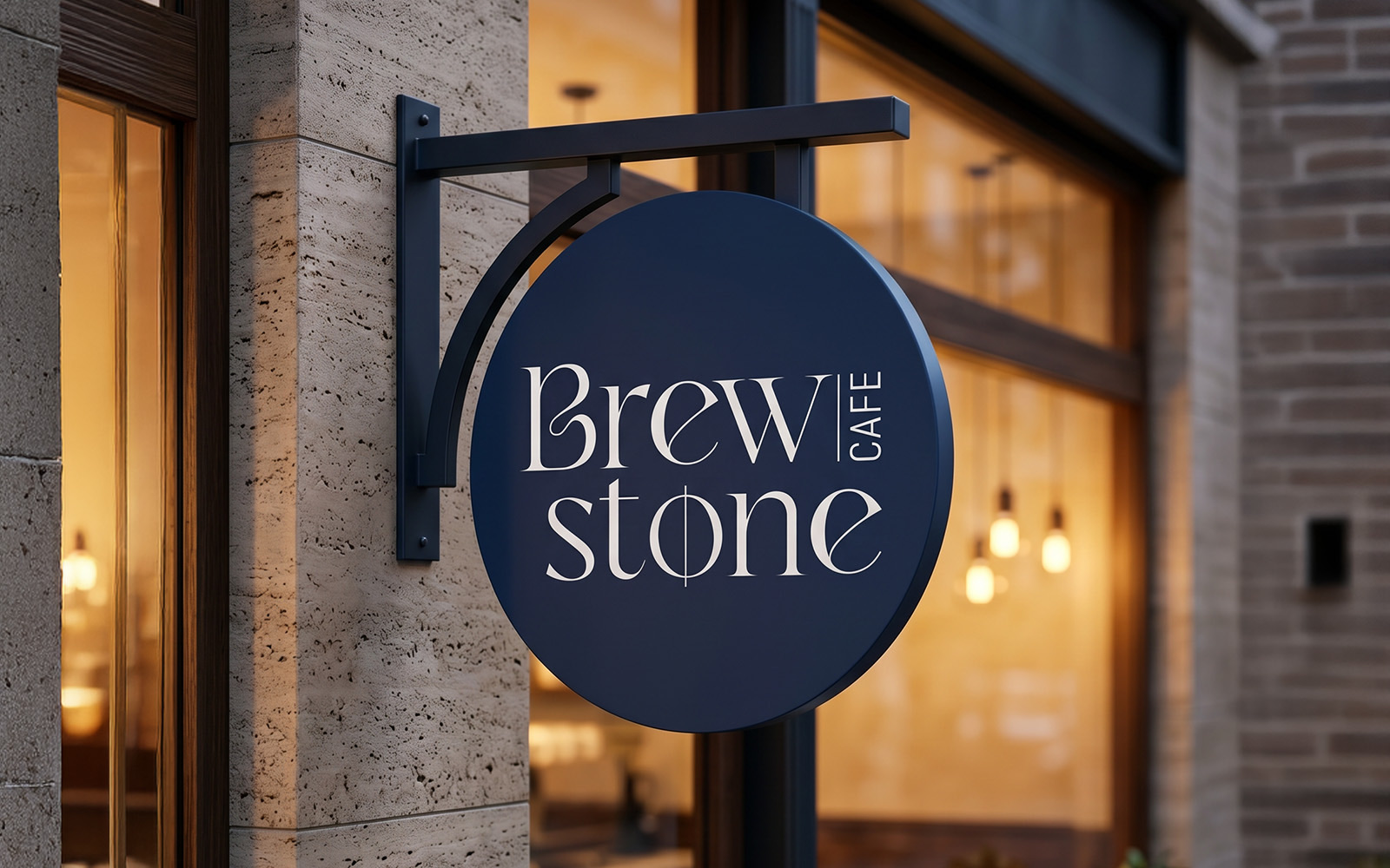
A wordmark with two weights, a single colour world, a feed that snaps together.
Brewstone